Notes about Typography
Notes of: AMBROSE, Gavin; HARRIS, Paul. The Fundamentals of Typography. AVA Publishing: Switzerland, 2011
Type and language
PHONOGRAM: A written symbol, letter, character or other mark that represents a sound, syllable, morpheme or word.
IDEOGRAM: A graphic element that represents an idea or a concept.
ICON: A graphic element that represents an object, person or something else.
SYMBOL: A graphic element that communicates the ideas and concepts that it represents, rather than denoting what it actually is.
PICTOGRAM: A graphic element that describes an action or series of actions through visual references or clues.
A few basics
A font is the physical means used to create a typeface, whether it be a typewriter, a stencil, letterpress blocks or a piece of PostScript code.
A typeface is a collection of characters, letters, numerals, symbols and punctuation, which have the same distinct design.
Standard typefaces generally fall into one of two broad categories: serif or sans serif. A serif typeface is one that has small cross lines at the ends of the different strokes, while a sans serif does not have these. These lines, often barely noticeable, aid our ability to recognize characters and help us to read by leading the eye across the page. For this reason, serif typefaces are typically easier to read than sans serifs. The clean lines of sans serif typefaces are seen as being modern, while serifs are more traditional.
Letter forms
Letter forms are the basic alphabetic and numeric characters that communicate within a design, and can be styled in many ways.
Roman: The basic cut of a typeface, so-called due to its origins in the inscriptions found on Roman monuments. Roman is sometimes referred to as book, although book is often a slightly lighter version of the Roman.
Italic: A true italic is a drawn typeface based around an angled axis. These are normally designed for serif typefaces. Obliques are slanted versions of sans-serif typefaces rather than a newly drawn version.
Light: A lighter or thinner version of the Roman cut.
Boldface: Bold, boldface, medium, semibold, black, super or poster all refer to a typeface with a wider stroke than the Roman cut.
Condensed and extended: Many type families include condensed and extended versions that provide additional typesetting flexibility. Condensed types are narrower than the Roman cut and are useful for tight space situations. Extended types are wider versions of the Roman type and are often used for headlines to dramatically fill a space. Both of these versions are often available in weight variations, from light through to black.
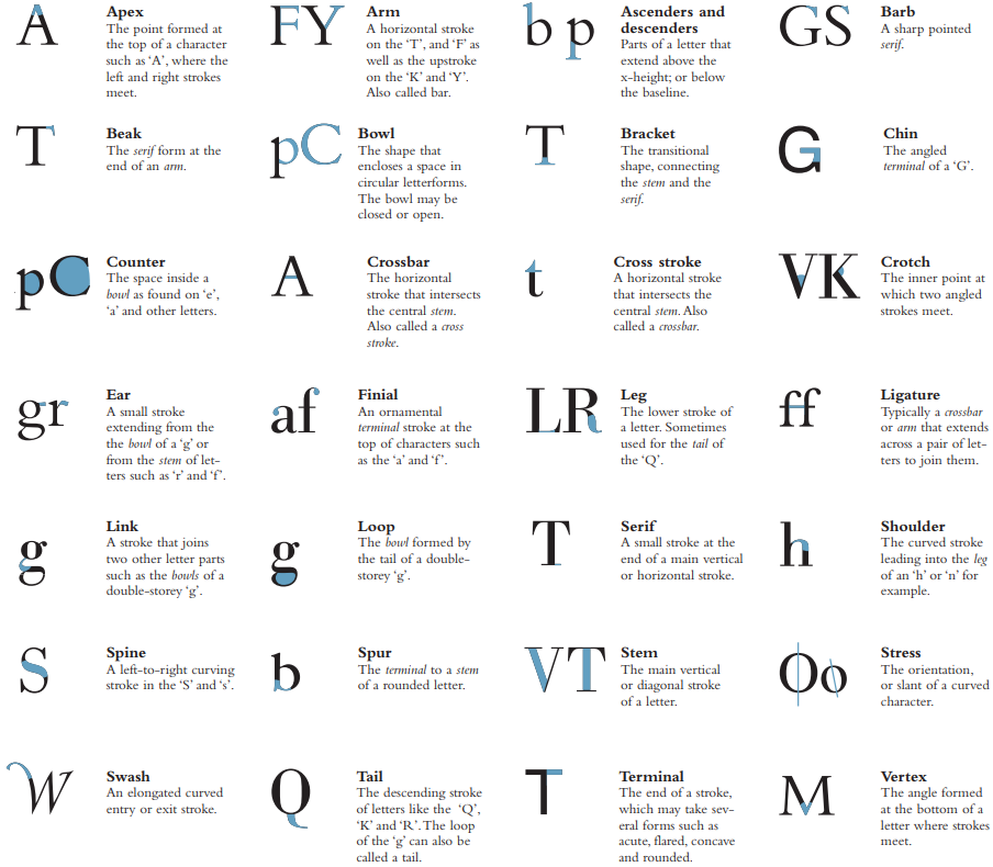
Serifs are a key characteristic for identifying a typeface – they can be employed in a variety of ways. Serifs are frequently said to enhance the readability of a piece of text by helping the eye to advance from one character to the next. Many serif styles reflect the zeitgeist of a particular time, with some more ornate or more bold, and others more discreet or more refined.
Words and paragraphs
Type size affects white space.
Flush left, ragged right: This alignment follows the principle of handwriting, with text tight and aligned to the left margin and ending ragged on the right.
Centered: Centered aligns each line horizontally in the center to form a symmetrical shape on the page, with line beginnings and endings ragged. Raggedness can be controlled to a certain extent by adjusting line endings.
Flush right, ragged left: Right aligning text is less common as it is more difficult to read. It is sometimes used for picture captions and other accompanying texts, as it is clearly distinct from body copy.
Justified horizontally: Justified text allows the appearance of rivers of white space to appear. It can cause plagues of hyphenation if words are allowed to split to prevent this.
The use of word spacing, hyphenation and justification functions allows for greater control of word spacing in a text block by controlling the space between words.
Using type
Arguably one of the most important aspects when considering typography is adding a sense of hierarchy. Hierarchy is a logical and visual way to express the relative importance of different text elements by providing a visual guide to their organization. A text hierarchy helps make a layout clear, unambiguous and easier to digest.
Color can be used to provide a logical, visual hierarchy for text, in addition to providing definition, contrast and added meaning to text elements.
The use of type on screen shares many of the requirements and concerns of type on a printed page. The same thought patterns govern the use of layout and the font choices made, but the end result is a little less controllable.
